In case you missed it, TechCrunch has a brand new look and they did a ton of research and user testing to drive the update. I think that anytime a company does a site redesign there are some great lessons to be learned that can be applied across multiple markets. If you think about it there was most-likely hundreds of thousands of dollars worth or time and research spent on the redesign which means you can get many of the same lessons for hundreds of thousands of dollars less.
TechCrunch did a great post detailing the new design and there were three things that really stood out to me that I thought would also be interested to all of you, enjoy!
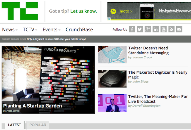
- Simplified Logo – gone is the heavily pixelated logo, now it’s one solid shade of green. Sure it might seem like a small change but these small changes make a big difference. The busier your logo is the more it can distract from the content of your site, so even though you might like a more complex and artsy logo make sure this doesn’t divert your visitor away from where you want them to focus.
- Greater focus on featured/popular content – if you’ve ever studied landing page optimization (or been to one of Tim Ash’s awesome talks) then you know that when people go to a site their eyes immediately zoom to the top-left quadrant. You will notice that TechCrunch now has a large format featured post in the upper left-hand corner, they know this is where you eyes will go so this is there they put the hottest content.
- Responsive – let’s be honest, the world has changed and while all of your visitors used to browse your site on a computer that number is declining, and fast. In many cases a majority of your audience will be looking at your site on a smartphone or tablet. TechCrunch has taken their responsive design to the next level making sure the site looks great on your phone all the way up to your 27″ Apple Cinema Display.